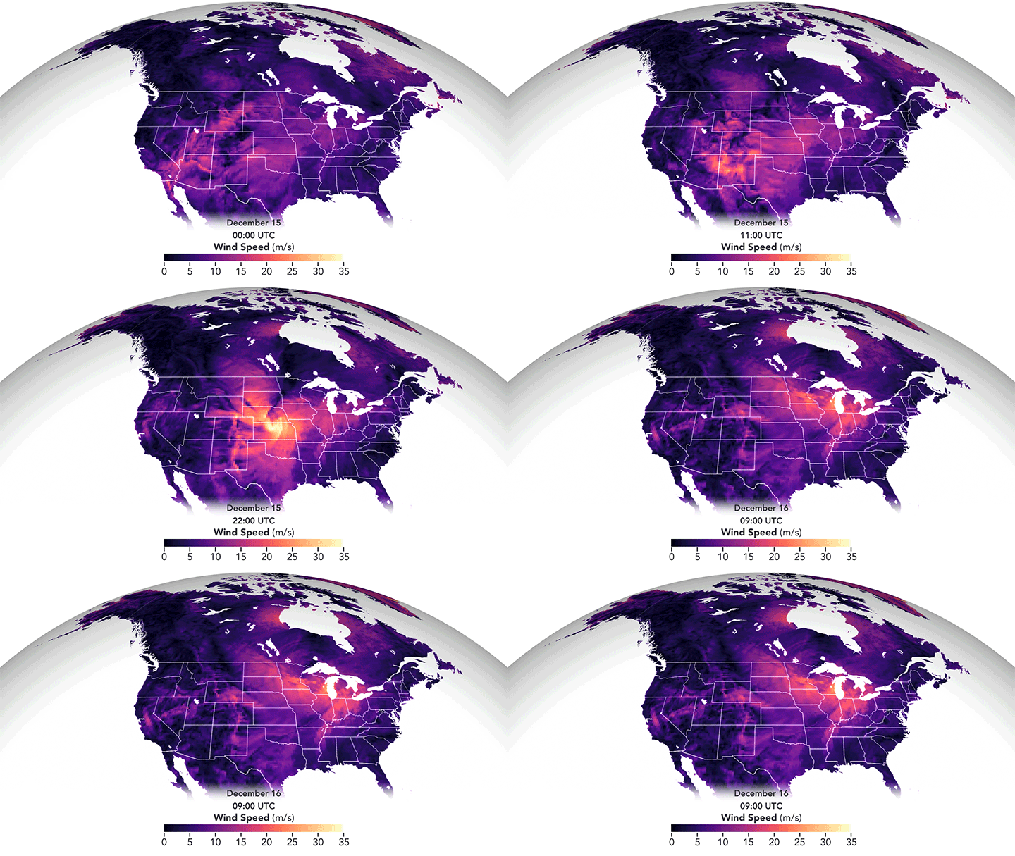
I confess I’d never heard the term derecho before moving to Colorado, but I’ve experienced a few of these wind storms now. They’re intense! Last December’s derecho formed when a high-pressure system in the western United States met a strong low-pressure system over the northern plains. In fluids, flow moves preferentially from areas of high pressure to those with low pressure, and that’s no different when it comes to weather. The strong pressure gradient drove high winds from the Rocky Mountains to Minnesota. The animation above shows the strongest winds in in yellow-white but even the “weaker” pink areas saw winds comparable to a fast-moving car in speed. The visualization is constructed from data reported by ships, buoys, aircraft, satellites, and other sources, all processed through a NASA weather algorithm. (Image credit: J. Stevens/NASA; via NASA Earth Observatory)
Search results for: “flow visualization”

The Best of FYFD 2021




A year ago I observed what a strange year 2020 had been, and in many ways, I could say the same of 2021. Before the pandemic, I spent quite a lot of time traveling. In 2021, the only nights I slept outside my own bed came on a long weekend up to the mountains with my family. But 2021 also saw a bit of a return to normalcy – I was giving keynote addresses and workshops again, albeit virtually. What will 2022 hold? Who knows?!
As per tradition, here are the top FYFD posts of 2021:
- A superior mirage leaves a ship floating in mid-air
- Drone videos of sheep herding are mesmerizing
- Permeable pavement allows water to drain
- The slow and dreamy fluid landscape of “Le Temps et l’Espace”
- What do you do when you’re an insect researcher with a high-speed camera?
- Satellite images… or paint?
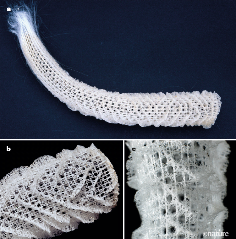
- The intricate lacework of the Venus’s flower basket sea sponge
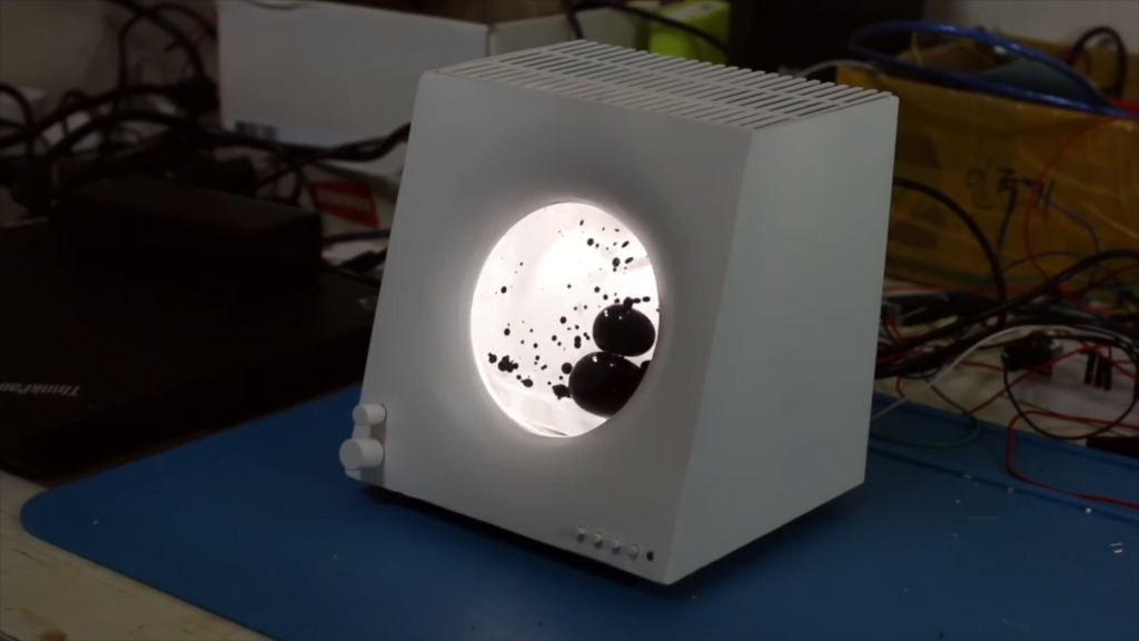
- Building a Bluetooth speaker with ferrofluid music visualization
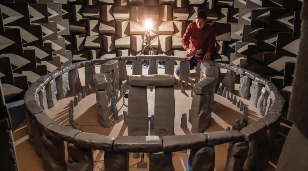
- Finding the acoustics of Stonehenge
- Making butter by traditional French methods
It’s an eclectic mix of topics this year: bizarre phenomena, stunning art, archaeological exploration, and a touch of biophysics!
If you enjoy FYFD, please remember that it’s primarily reader-supported. You can help support the site by becoming a patron, making a one-time donation, buying some merch, or simply by sharing on social media. And if you find yourself struggling to remember to check the website, remember you can get FYFD in your inbox every two weeks with our newsletter. Happy New Year!
(Image credits: mirage – D. Morris, sheep – L. Patel, pavement – Practical Engineering, Le Temps – T. Blanchard, insects – Ant Lab, Satellike – R. De Giuli, sea sponge – G. Falcucci et al., speaker – DAKD Jung, Stonehenge – T. Cox et al., butter – Art Insider)
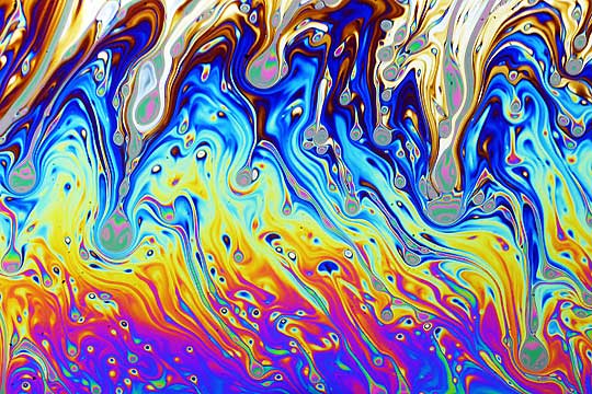
Psychedelic Soap Film
Macro images of a soap film burst with color. Because the color comes from interference between light waves bouncing off the inner and outer surfaces of the soap film, the colors we see correspond directly to the thickness of the soap film. So the patterns we see reflect actual flows and variations inside the soap film. It’s not unusual for the patterning on a soap film to become increasingly complicated as the film drains and ages. Eventually black spots — areas too thin for interference to show visible colors — will appear and grow, and the film will pop.
If you’re interested in trying out some soap film photography for yourself, Professor Andrew Davidhazy has a nice description on his website of the set-up he used for this photo. (Image credit: A. Davidhazy; via Flow Vis)

“Waves”
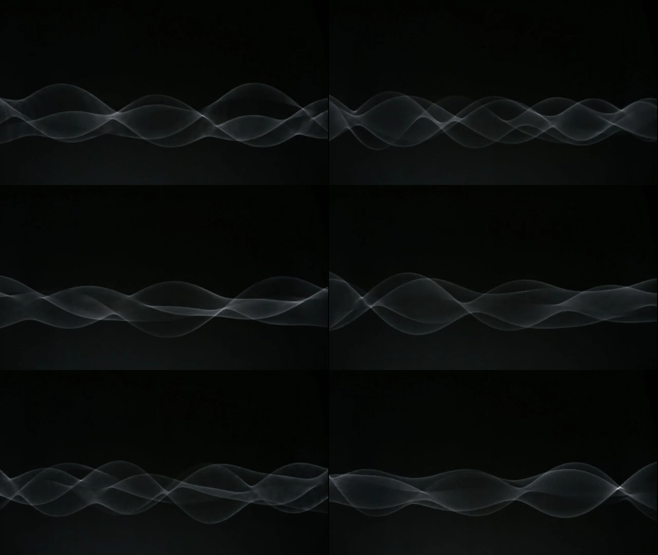


The “Waves” installation by artist Daniel Palacios appears deceptively simple, just a rope mounted between two motors. But once the motors start spinning, it is anything but. The installation shifts in response to those around it, creating varying numbers of steady, standing waves or even wildly chaotic ones that whistle through the air. It’s a neat visualization of one of the most commonly-measured quantities in physics: the changes in a wave with time. (Video and image credit: D. Palacios; via Flow Vis)

10 Years of FYFD
10 years. 2,590 posts. 21 original videos. 378,000+ followers. Countless hours spent blogging and more than 1,000 journal articles read. When I started FYFD ten years ago as a PhD student, I never imagined the impact the blog would have on my life, my career, or my field. It’s been a wild ride, and I’d like to take a moment today to thank each and every one of you for contributing to this journey, whether it’s by supporting on Patreon, liking a post, sharing content, submitting ideas, leaving a comment, sending an email, or saying hi at an event. FYFD would have petered out long ago if not for your support!
Ten years seems like a good time for a little retrospective, so I went back through the archive in search of the most popular post (based on Tumblr’s notes) from each of those ten years. Here’s what I found:
Year 1: The Vortex Street
Year 2: Wave Clouds Over Alabama
Year 3: Surface Tension in Action
Year 4: Why Honeycomb is Hexagonal
Year 5: Bioluminescence
Year 6: Self-Pouring Fluids
Year 7: Watching Radiation
Year 8: The Swimming of a Dead Fish
Year 9: Seeing the Song
Year 10: Collective Catfish ConvectionIf you’d rather enjoy something random rather than something “popular”, you can always use the shortcut https://fyfluiddynamics.com/random to explore posts in the archive.
And in case you’re more interested in watching videos, here are the top FYFD videos (by YouTube views):
(Wow, my editing and production skills have evolved since some of those earlier vids!)
So what are your favorite FYFD memories and posts? Let me know in the comments! (Image and video credits: N. Sharp)

Marangoni Bursting

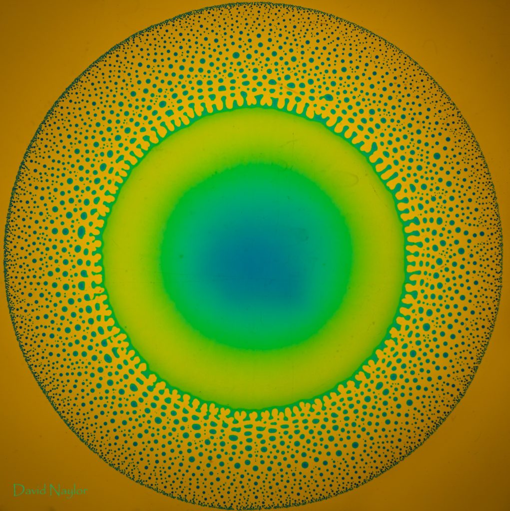

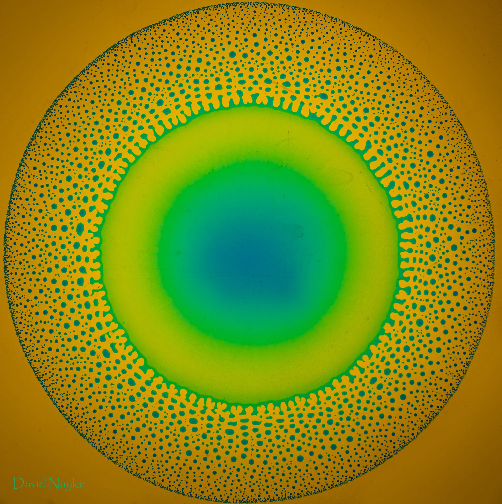

Placing a mixture of alcohol and water atop a pool of oil creates a stunning effect that pulls droplets apart. The action is driven by the Marangoni effect, where variations in surface tension (caused in this case by the relative evaporation rates of alcohol and water) create flow. David Naylor captures some great stills of the flow, including the only example of a double burst I’ve seen so far. For more on the science behind the effect, check out this previous post or the original research paper. (Image credit: D. Naylor; see also this previous post)
Aerosol Transport


NASA Goddard has produced another gorgeous visualization of how various aerosols move around our world. This visualization is constructed from data collected between August 2019 and January 2020, which means that it captures numerous typhoons as well as the extreme bushfires that occurred in Australia.
Different colors represent different aerosol sources: carbon (red), sulfate (green), dust (orange), sea salt (blue), and nitrate (pink). The brighter the color, the higher the concentration of aerosols. With this, we see steady patterns of natural sea salt transport and the billowing flow of dust from Saharan Africa. But we can also see manmade pollution from sources across the Northern Hemisphere, as well as major output from the Australian bushfires. It’s a good reminder that none of us is truly isolated in this interconnected world of ours. (Video and image credit: NASA Goddard; via Flow Vis)
Singing in the MRI


We rarely consider just how complex the process is when we speak or sing. Sound waves produced in our larynx are shifted and amplified by the geometry of our throats, mouths, sinus cavities, tongues, and lips. This video provides a glimpse of that hidden complexity through a trained vocalist singing inside an MRI machine. He sings the same aria in four distinctly different vocal styles, and it’s incredible to watch all the changes his tongue, lips, and soft palette go through to produce those different sounds. (Image and video credit: T. Ross; via Flow Vis)
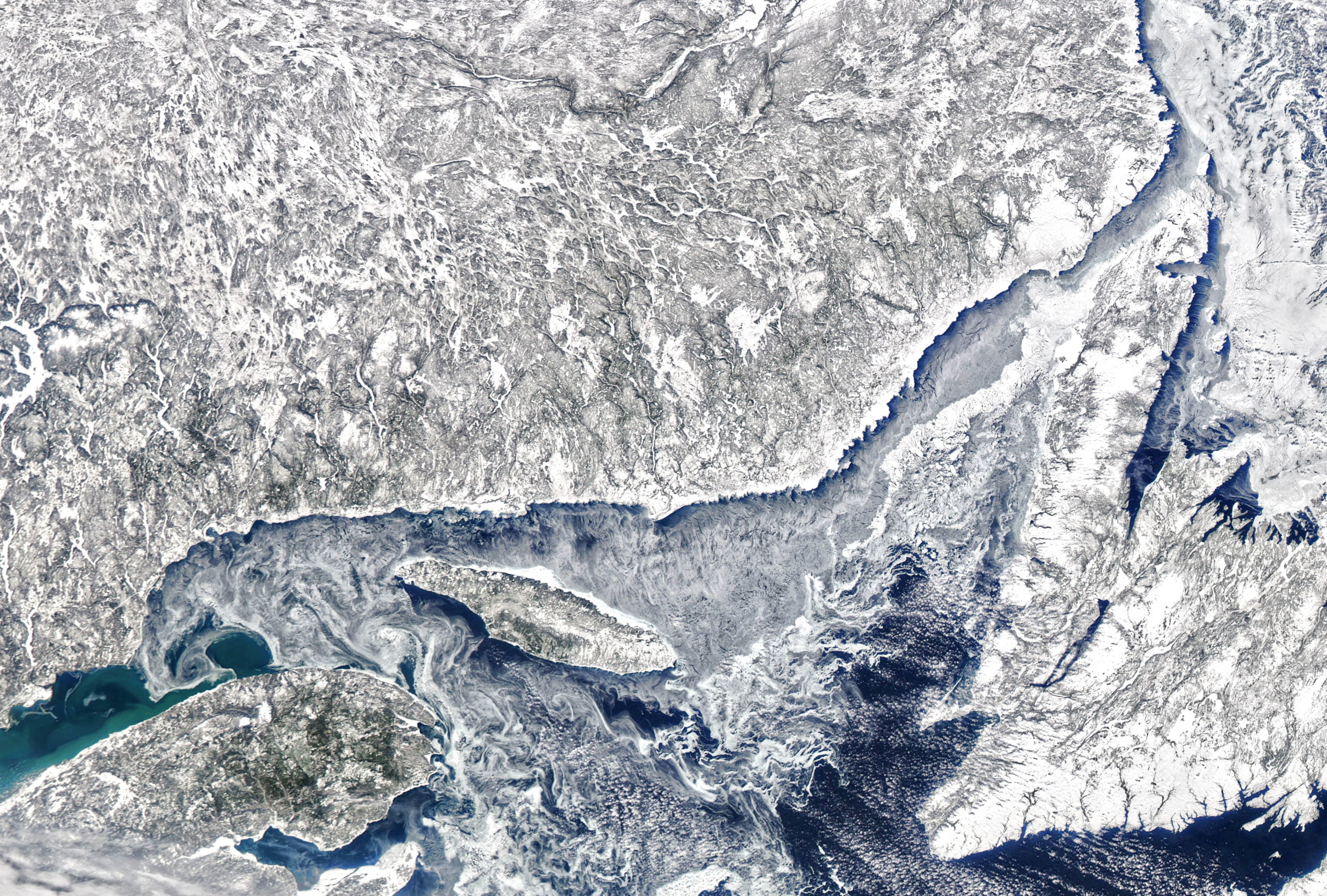
Icy Swirls
Rafts of sea ice follow swirling eddies in this satellite image of the Gulf of St. Lawrence. Just as with phytoplankton blooms and sediment, this thin sea ice can be moved by wind and currents to reveal hidden flow patterns. Experimentalists use many similar diagnostics that introduce bubbles, particles, smoke, and other tracers into flows to visualize motion that’s otherwise invisible. (Image credit: J. Stevens/NOAA/NASA; via NASA Earth Observatory)
Blowing Vortex Rings from Bubbles


When bubbles burst, we often pay attention to the retracting film and forming droplets, but what happens to the air that was inside? By placing a little smoke inside them, we can see. The air inside these bubbles is slightly pressurized compared to the ambient, and as such a bubble ruptures, its air gets pushed out the expanding hole. That momentum makes the air curl as it forces its way into the surrounding air, creating a stack of vortex rings. The researchers observed as many as six stacked vortices from bubbles just under 4 cm in diameter. (Image and research credit: A. Dasouqi and D. Murphy; video credit: Science; see also A. Dasouqi and D. Murphy)