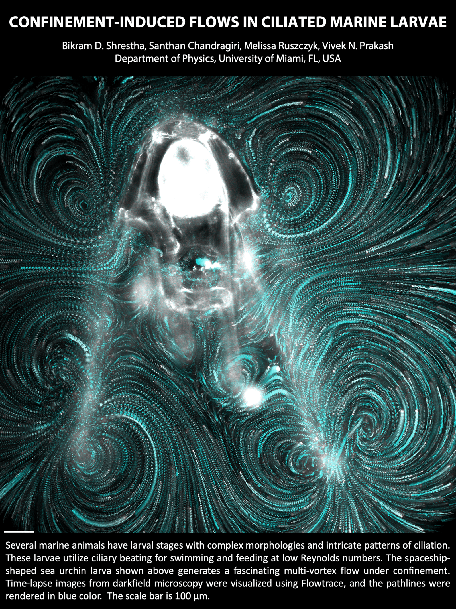
For tiny creatures, swimming through water requires techniques very different than ours. Many, like this sea urchin larva, use hair-like cilia that they beat to push fluid near their bodies. The flows generated this way are beautiful and complex, as shown above. Importantly for the larva, the flows are asymmetric; that’s critical at these scales since any symmetric back-and-forth motion will keep the larva stuck in place. (Image credit: B. Shrestha et al.)
Search results for: “flow visualization”

Dancing to Chopin


Droplets of paint whirl to Chopin’s “Nocturne Op. 9 No. 2” in this short film from artist Thomas Blanchard. The glitter particles in the paints act as seed particles that highlight the flow within and around each drop. It’s a beautiful dance of surface tension, advection, and buoyancy. (Image and video credits: T. Blanchard; via Colossal)

“Shaken, Not Stirred”


James Bond notoriously orders his martinis “shaken, not stirred,” a request bartenders fulfill by shaking the cocktail over ice in a separate shaker. But what if you shake the martini glass itself? That’s the question that inspired this lovely mixology.
By shaking the martini glass gently back and forth (along the directions shown by the arrows in each image), the team created different mixing patterns within the glass. With a little food dye and pearl dust, they visualized the flows they found. By changing the viscosity of the cocktail and the speed of the swish, they made everything from a four-leaf clover to a cadre of ghosts. It seems that martini glasses hold a flow for every occasion! (Image and research credit: X. Song et al.; submitted by Zhao P.)

GFM poster, describing the experiments used to create these picturesque martinis. 
Fish Fins Work Together
Researchers studying how fish swim have long focused on their tail fins and the flows created there. But a fish’s other fins have important effects, too, as seen in this recent study. Researchers built a CFD simulation based on observations of a swimming rainbow trout, focusing on the flow from its back and tail fins. They found that the vortex created by the back fin stabilizes and strengthens the one generated by the tail. It also played a role in reducing drag on the fish by maintaining the pressure difference across the body. When they tried changing the size and geometry of the fins, the fish’s efficiency suffered, indicating that evolution has already optimized the trout’s fins for swimming efficiency. (Image credits: top – J. Sailer, simulation – J. Guo et al.; research credit: J. Guo et al.; via APS Physics)

Visualization of flow around a digitized rainbow trout. 
The Chicxulub Impact’s Tsunami
66 million years ago an asteroid struck offshore of what is now Chicxulub near the Yucatán Peninsula in Mexico. The impact and its aftermath are widely credited with a mass extinction that wiped out 75% of plant and animal life on Earth, including non-avian dinosaurs. Since the impact occurred in shallow waters, it also generated a tsunami, one over 30,000 times bigger than any in recorded history.

Snapshot showing the spreading tsunami after the asteroid’s impact. Click on the image to go to NOAA’s website and watch the video. In this simulation, researchers show how that tsunami spread globally. The initial wave was about a mile high but stretched up to about 2.5 miles as it rushed ashore. Worldwide, every shoreline saw flows at 20 cm/s or higher as the wave hit. In the image above, black areas show the landmasses as they existed at the time, with modern borders shown in white outline. To watch the video, click on the image or head to NOAA’s visualization.
You may wonder how scientists can validate a simulation like this one, which so wildly exceeds any recorded event. One way they judged these results is by looking at the sedimentary records of the seafloor. Their results show flows large enough to scour the seafloor and disrupt any sedimentary records in those areas, and, sure enough, those regions hold no records older than the asteroid’s impact. That alignment between the geological record and the simulation’s highest flow areas helps establish confidence in the results. (Image credit: illustration – SWRI/D. Davis, simulation – NOAA; research credit: M. Range et al.; submitted by Kam-Yung Soh)
“Reconfiguring It Out”


Leaves flutter and bend in the breeze, changing their shape in response to the flow. Here, researchers investigate this behavior using flexible disks pulled through water. The more flexible the disk and the faster the flow, the more cup-like the disk’s final shape. Adding tracer particles to the water allows them to visualize the flow behind the disk. Every disk leaves a donut-shaped vortex ring spinning in its wake, but the more reconfigured the disk, the narrower the vortex. This, ultimately, reduces drag on the disk. That’s why trees in heavy winds streamline their branches and leaves; that flexibility lowers the drag the tree’s roots have to anchor against. (Image and video credit: M. Baskaran et al.)
Spinning Off-Axis
To make a vortex in the laboratory, researchers typically set a tank on a rotating platform and allow the water to drain out a hole in the center of the tank. In that case, a vortex forms over the drain (like in your bathtub!) and remains centered over the hole. In nature, though, vortices rarely follow such a simple path.
In this experiment, researchers moved the drainage hole so that it is not aligned with the tank’s axis of rotation. Although the vortex forms over the drain (marked by a yellow dot in the lower image), it quickly moves away, following a roughly circular path around the axis until it comes to a stop. Green dye marks fluid from the tank’s bottom boundary layer, which eventually gets entrained up into the vortex. (Image and research credit: R. Munro and M. Foster; via Physics Today)

Timelapse animation showing the development of the vortex. The yellow dot marks the location of the drain. 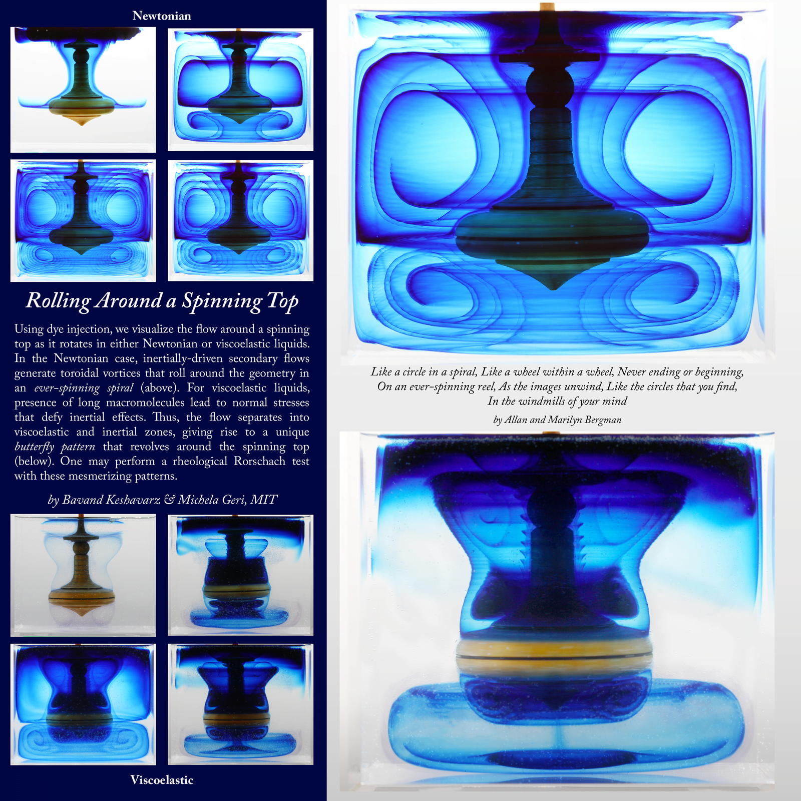
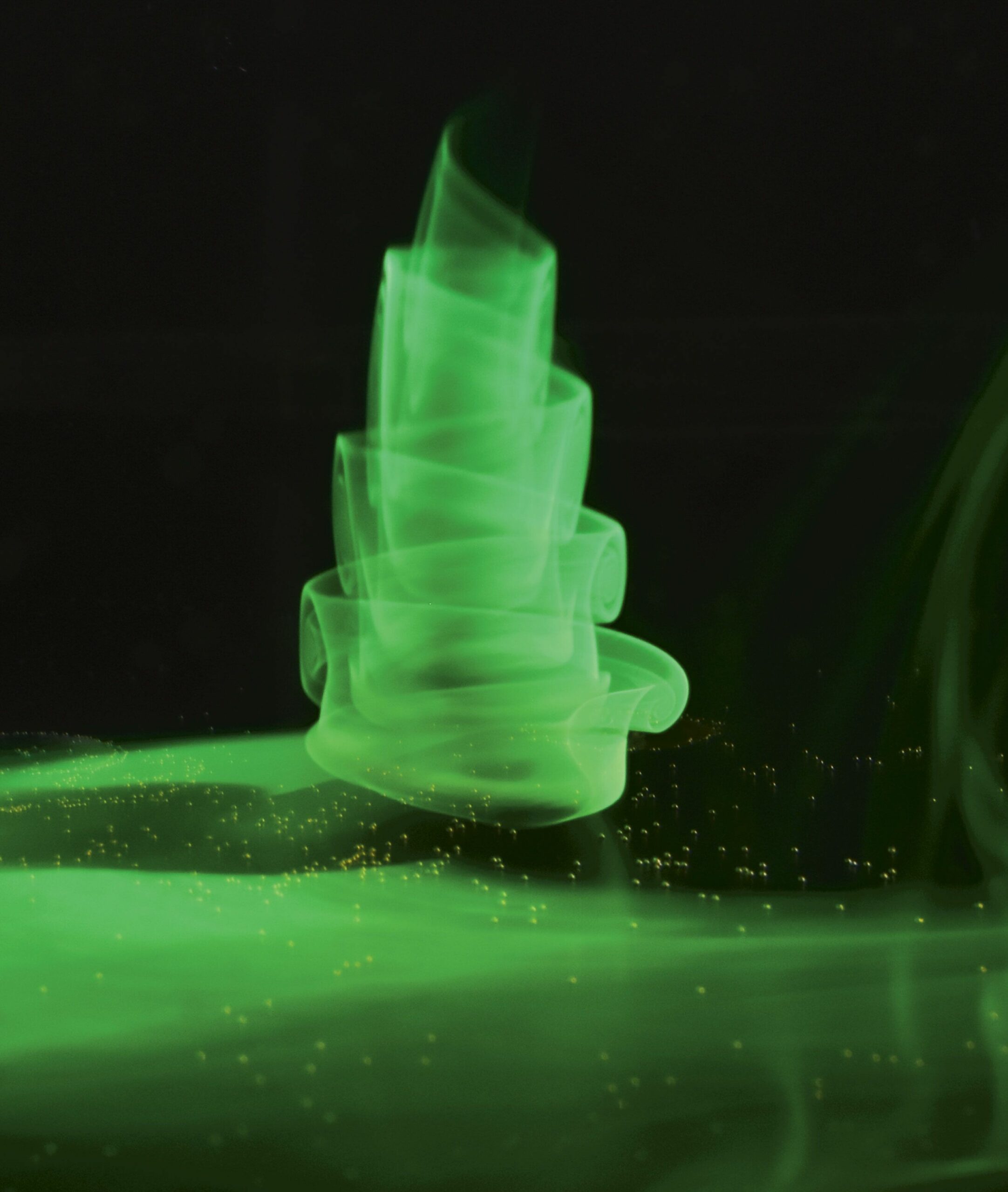
Spinning Tops
What does the flow look like around a spinning top? Here, researchers used dye to visualize what happens in a Newtonian fluid (like air or water) as well as a viscoelastic fluid. The Newtonian fluid (upper images) divides into two circulating zones, one below the top and one above. They both take the shape of a toroidal, or donut-shaped, vortex, visible here in cross-section.
The long molecules of the viscoelastic fluid lend it elasticity to resist stretching. The result is a very different flow field. Beneath the top, there’s still a toroidal vortex, though it appears tighter. But around the upper part of the top, there’s a butterfly-like region of recirculation! (Image credit: B. Keshavarz and M. Geri)
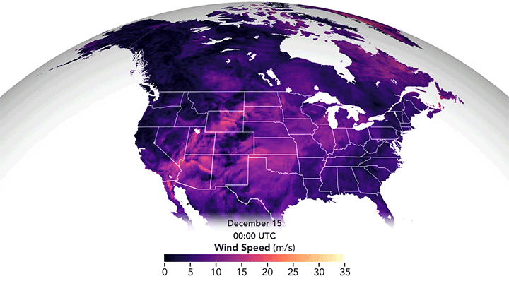
December’s Derecho
I confess I’d never heard the term derecho before moving to Colorado, but I’ve experienced a few of these wind storms now. They’re intense! Last December’s derecho formed when a high-pressure system in the western United States met a strong low-pressure system over the northern plains. In fluids, flow moves preferentially from areas of high pressure to those with low pressure, and that’s no different when it comes to weather. The strong pressure gradient drove high winds from the Rocky Mountains to Minnesota. The animation above shows the strongest winds in in yellow-white but even the “weaker” pink areas saw winds comparable to a fast-moving car in speed. The visualization is constructed from data reported by ships, buoys, aircraft, satellites, and other sources, all processed through a NASA weather algorithm. (Image credit: J. Stevens/NASA; via NASA Earth Observatory)

The Best of FYFD 2021


A year ago I observed what a strange year 2020 had been, and in many ways, I could say the same of 2021. Before the pandemic, I spent quite a lot of time traveling. In 2021, the only nights I slept outside my own bed came on a long weekend up to the mountains with my family. But 2021 also saw a bit of a return to normalcy – I was giving keynote addresses and workshops again, albeit virtually. What will 2022 hold? Who knows?!
As per tradition, here are the top FYFD posts of 2021:
- A superior mirage leaves a ship floating in mid-air
- Drone videos of sheep herding are mesmerizing
- Permeable pavement allows water to drain
- The slow and dreamy fluid landscape of “Le Temps et l’Espace”
- What do you do when you’re an insect researcher with a high-speed camera?
- Satellite images… or paint?
- The intricate lacework of the Venus’s flower basket sea sponge
- Building a Bluetooth speaker with ferrofluid music visualization
- Finding the acoustics of Stonehenge
- Making butter by traditional French methods
It’s an eclectic mix of topics this year: bizarre phenomena, stunning art, archaeological exploration, and a touch of biophysics!
If you enjoy FYFD, please remember that it’s primarily reader-supported. You can help support the site by becoming a patron, making a one-time donation, buying some merch, or simply by sharing on social media. And if you find yourself struggling to remember to check the website, remember you can get FYFD in your inbox every two weeks with our newsletter. Happy New Year!
(Image credits: mirage – D. Morris, sheep – L. Patel, pavement – Practical Engineering, Le Temps – T. Blanchard, insects – Ant Lab, Satellike – R. De Giuli, sea sponge – G. Falcucci et al., speaker – DAKD Jung, Stonehenge – T. Cox et al., butter – Art Insider)