Evolution often requires compromise between competing effects. Large-eared bats, for example, rely on the size of their ears to aid their echolocation, but such large ears can hurt them aerodynamically, thus limiting their flight. Results from a recent experiment, however, suggest that large ears are not a total loss aerodynamically speaking. Researchers used particle image velocimetry to study the wakes behind free-flying, large-eared bats and found significant downward flow behind the bats’ bodies. This indicates that the bats generate some lift with their ears, body, and/or tail. The position and tilt of the ears in flight is similar to forward swept wings, which the authors suggest could help contract the wake behind the ears and reduce its negative influence on flow over the wings. Although the evidence is not yet conclusive, the study does suggest that large ears may be more aerodynamically beneficial than they appear. (Image credit: L. Johansson et al./Lund University, source; via Jalopnik)

The next FYFD webcast will be this Saturday, May 21st at 1pm EDT. My guests will be Professor Jean Hertzberg of the University of Colorado at Boulder and Professor Kate Goodman of the University of Colorado at Denver. Dr. Hertzberg is the creator of the course Flow Visualization, an interdisciplinary course combining engineering, art, and fluid dynamics. It’s a class (and website) that’s been an inspiration for me and FYFD since the early days! Dr. Goodman, an expert in engineering education, earned her PhD studying the Flow Viz course and its impact. This will be wide-ranging discussion – with everything from experimental fluid dynamics and engineering education to art, photography, and hopefully even cardiac fluid dynamics!
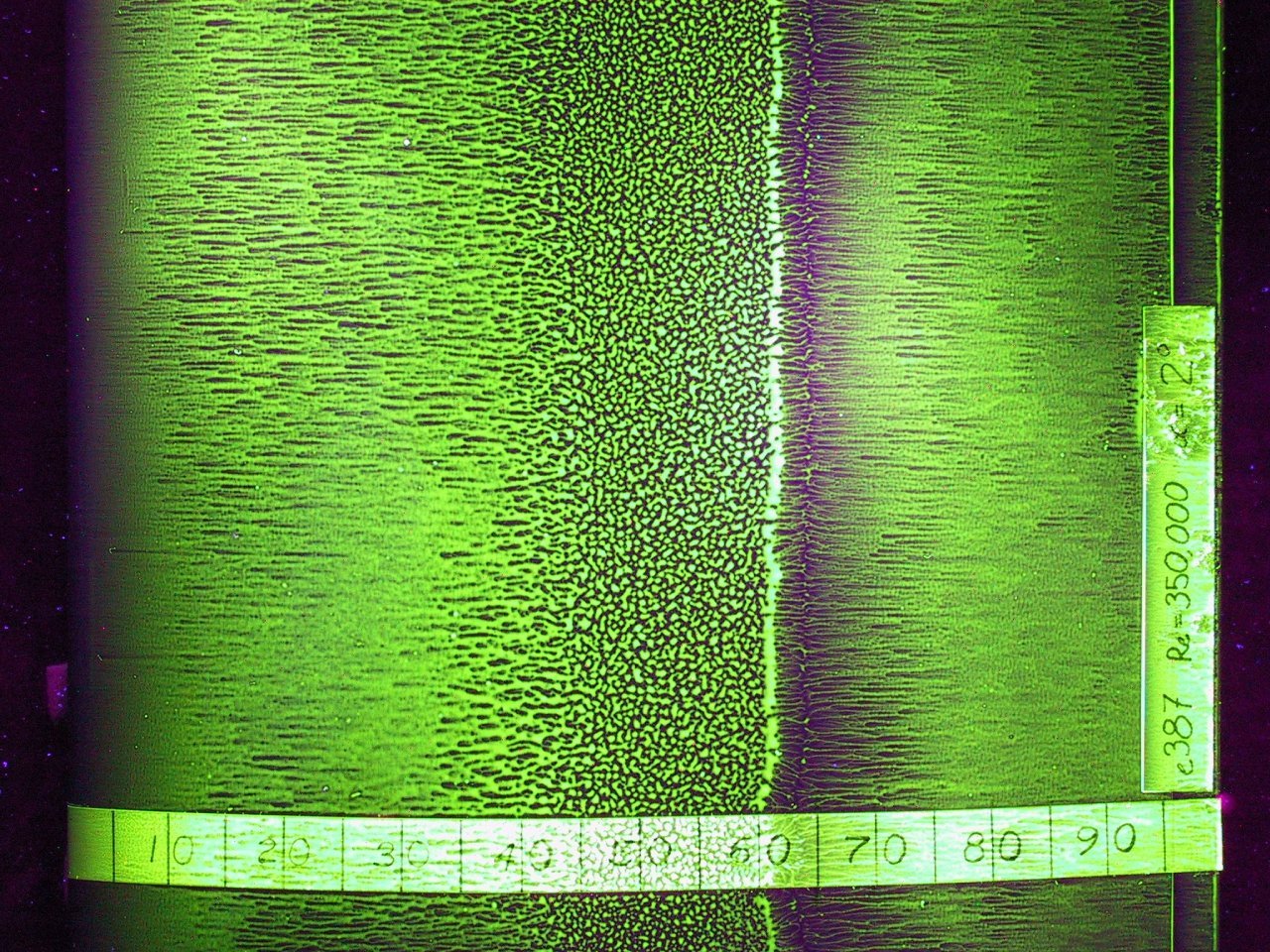
(Original images: P. Davis et al.; B. Moore; L. Swift et al.)