Search results for: “flow visualization”

  • Erie Waves

    Erie Waves

    Photographer Dave Sandford braved the cold and turbulent waters of Lake Erie in late fall to capture some remarkable wave action. Like on the ocean, waves in the Great Lakes are largely driven by winds, but lakes don’t develop the constant set of rolling waves that oceans do. Instead their waves are more erratic and unpredictable. Sandford focused on capturing the moment when wind-driven waves coming into shore collided with waves rebounding from piers or rocks along the shore. The results are waves that, through Sandford’s lens, look like exploding mountainsides. Such energetic waves mix sediment and nutrients in the lake, and the spray of droplets can even loft aerosols and pollutants from the water into the atmosphere.   (Photo credit: D. Sandford; via Flow Vis)

  • Featured Video Play Icon

    Simulating the Earth

    Computational fluid dynamics and supercomputing are increasingly powerful tools for tracking and understanding the complex dynamics of our planet. The videos above and below are NASA visualizations of carbon dioxide in Earth’s atmosphere over the course of a full year. They are constructed by taking real-world measurements of atmospheric conditions and carbon emissions and feeding them into a computational model that simulates the physics of our planet’s oceans and atmosphere. The result is a visualization of where and how carbon dioxide moves around our planet.

    There are distinctive patterns that emerge in a visualization like this. Because the Northern Hemisphere contains more landmass and more countries emitting carbon, it contains the highest concentrations of carbon dioxide, but winds move those emissions far from their source. As seasons change and plants begin photosynthesizing in the Northern Hemisphere, concentrations of carbon dioxide decrease as plants take it up. When the seasons change again, that carbon is re-released.

    These visualizations underscore the fact that these carbon emissions impact everyone on our planet–nature does not recognize political borders–and so we share a joint responsibility in whatever actions we take. (Video credit: NASA Goddard; h/t to Chris for the second vid)

  • Featured Video Play Icon

    Where Does the Sun End?

    How do you define the edge of our sun? There’s a distinct surface to it, but our star is also surrounded by the corona, an even hotter region of plasma twisted by magnetic fields. The corona is sort of like the sun’s atmosphere. Farther out in the solar system, we receive a constant barrage of charged particles, known as the solar wind, that streams out from the sun. So where does the corona end and the solar wind begin?

    Scientists have been studying the flow structure of the solar wind in search of an answer to this question, and they’ve found that there’s a clear transition point about 32 million kilometers from the sun. At this distance, the sun’s magnetic field weakens to the point where it no longer exerts the same hold on the solar particles and they begin to move turbulently, behaving more like a gas than a plasma. With special measurements and image processing, scientists were able to actually see this flow change in the solar wind! (Video/image credit: NASA; research credit: C. DeForest et al.; via FlowViz)

  • Rio 2016: The Swimming Pool Controversy

    Rio 2016: The Swimming Pool Controversy

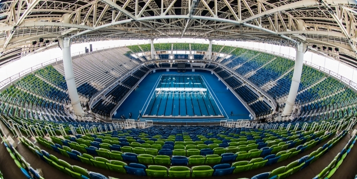
    Statistical analysis suggests possible current in the Rio Olympics swimming pool

    Several news outlets, beginning with The Wall Street Journal, are reporting that the swimming pool in Rio may have had a current that biased athletes’ performances. This is based on a statistical analysis of athlete performances across the meet, conducted by Indiana University’s Joel Stager and his coworkers. According to WSJ, Stager et al. analyzed times of athletes in the preliminary, semifinal, and final races of the 50m, 800m, and 1500m events and found consistent evidence that swimmers in the higher numbered lanes swam faster when moving toward the starting block and swimmers in the lower numbered lanes swam faster when moving toward the turn end of the pool. A separate analysis by Barry Revzin at Swim Swam came to similar conclusions about the direction and magnitude of lane effect in Rio.

    Past questions about lane bias

    This is not the first time questions have been raised about a current-induced bias in competition pools. In fact, Stager and his colleagues published an analysis in 2014 that suggested a similar bias in the pool used for the 2013 World Championships in Barcelona. That pool was a temporary pool built specifically for the competition by Myrtha Pools and was disassembled immediately after, before Stager et al.’s analysis was published.

    A more recent paper by Stager and his colleagues found that lane bias seems to be more prevalent in temporary pools than in permanent ones. The Rio Olympics pool, like the 2013 Worlds pool, is a temporary pool also built by Myrtha Pools.

    Myrtha Pools responds to the criticism 

    Myrtha responded to both WSJ and Swim Swam by sharing videos (1, 2) of their current test, which was conducted before the competition and on Day 3 of competition. The videos show a floating object in one of the outside lanes; neither video shows any noticeable movement of the object.

    Fluid dynamics and swimming pool design

    Competitive swimming pools are complicated recirculating systems that can contain special structures intended to minimize interactions between competitors. Myrtha has built many special event pools in recent years, including ones where the results did not show a bias. According to their website, Myrtha has fluid dynamicists on staff and uses computational fluid dynamics (CFD) to analyze pool performance during design, although they only show examples of freeform pools – not competition pools.

    In fact, I have found remarkably few CFD analyses of swimming pools in the literature. Most papers seem to focus on distribution of disinfectants in pools or in predicting evaporation rates – both practical problems but ones with limited relevance to this particular question.

    So, is there a current in the Rio pool?

    It’s tough to say with certainty that there is a current in Rio’s pool. The performance analyses by Stager et al. and by Revzin do show anomalies in the times of athletes in Rio based on their swim lane, and they show that those anomalies do not exist in many other recent competitions.

    I also do not think Myrtha’s current test constitutes evidence of a lack of current. Their floating object is only indicative of conditions at the air-water interface. Swimmers ride lower in the water and spend significant time completely underwater. Lane markers may also damp any flow effects near the surface.

    I think introducing dye underwater in the pool would do more to reveal any flow that may exist, and this would be a worthwhile test to conduct prior to the deconstruction of the Rio Olympic pool. Additionally, it would be wonderful to see a CFD analysis of the swimming pool, but this would require significant detail about the pool’s design (inlet and outlet locations, etc.) some of which is likely proprietary information.

    Neither dye visualization nor CFD simulation will change the results of this competition, but it may help reveal underlying issues in temporary pool designs so that any bias can be avoided in future competitions.

    (Image credit: Rio City Government)

    Special thanks to @MicahJGreen for bringing this story to my attention and to Dave B. for his assistance.

  • Rio 2016: Sailing and Rule 42

    Rio 2016: Sailing and Rule 42

    If you watch some of the sailing in Rio, you may hear commentators mention sailors being penalized for breaking Rule 42. Broadly speaking, Rule 42 says that sailors can’t use their body to propel the boat. While it seems like a little rocking couldn’t make much difference, it turns out events have these rules for good reason.

    One way to break Rule 42 is to perform sail flicking, demonstrated in the animation above. The sailor uses his or her body weight to roll the boat slightly, which causes the sail to flick. Aerodynamically speaking, we’d call this motion heaving. On the flexible sail, this unsteady motion decreases drag, allowing the boat to go faster. Done with the right frequency and amplitude, sail flicking actually makes the sail’s drag become negative, thereby creating thrust!

    The bottom image shows a visualization of the wake of a normal sail (left) and a sail being flicked (right). Both sails shed vortices in the downstream direction, but the flicked sail has much stronger vortices, indicated by the darker colors. In addition to giving a sailor an illegal boost, sail flicking creates more difficult, turbulent conditions for any competitors downstream, so it’s restricted in many (but not all) sailing events. (Image credits: AP Photos; Reuters; National Solo, source; research and flow diagram credit: R. Schutt and C. Williamson, pdf)

    Join us throughout the Rio Olympics for more fluid dynamics in sports. If you love FYFD, please help support the site!

  • Visualizing Smell

    Visualizing Smell

    Every day we’re surrounded by an invisible world of smells. Like the fluorescein dye in the animation above, these odors drift and swirl in the background flow. What you may not have stopped to consider when you smell the roses, though, is how the very act of sniffing changes the scent. When you inhale, filaments of the odor are drawn into your nose, and, likewise, when you exhale, your breathe mixes with the scent and sends it swirling outward in turbulent eddies. To see more about the science of scent, check out PBS News Hour’s full video below. (Video credit: PBS News Hour; GIF via skunkbear)

  • Bubble Tricks

    [original media no longer available]

    Everyone remembers playing with soap bubbles as a child, but most of us probably never became as adept with them as magician Denis Lock. In this video, Lock shows off some of the clever things one can do with surface tension and thin films. My favorite demo starts at 1:25, when he constructs a spinning vortex inside a bubble. He starts with one big bubble and adds a smaller, smoke-filled one beneath it. Then, using a straw, he blows off-center into the large bubble. This sets up some vorticity inside the bubble. When he breaks the film between the two bubbles, the smoke mixes into the already-swirling air in the larger bubble. Then he pokes a hole in the top of the bubble. Air starts rushing out the deflating bubble. As the air flows toward the center of the bubble, it spins faster because of the conservation of angular momentum and a miniature vortex takes shape.  (Video credit: D. Lock/Tonight at the London Palladium/ via J. Hertzberg)

  • Shelf Cloud

    Shelf Cloud

    Sydney, Australia was treated to a spectacular meteorological show over the weekend when an impressive shelf cloud swept over the city. These timelapses show the dramatic leading edge of the incoming thunderstorm. Notice how the cloud streams upward along the shelf. The storm is driven by this updraft of warm moist air, which rises until it is capped by the troposphere. At this point, the air spreads, creating an anvil-like shape, and cools. The moisture drawn up at the storm’s front will condense, freeze, and fall as rain or hail. When the updraft weakens, the storm will be dominated by the downdraft of the falling precipitation and eventually peter out. (Image credit: W. Reed and H. Vann, source; via J. Hertzberg)

  • Featured Video Play Icon

    Mediterranean Currents

    Ocean currents play a major role in the weather and climate of our planet. This video shows a simulation of the surface ocean currents in the Mediterranean and Atlantic over an 11-month period. Each second corresponds to 2.75 days. You’ll see many swirling eddies in the Mediterranean and more flow along the coastlines in the Atlantic. One observation worth noting: near the end of the video, you’ll notice that flow through the Strait of Dover between England and France changes its direction, flowing back and forth depending on tidal forces. In contrast, flow through the Strait of Gibraltar is always into the Mediterranean (within the timescale of the simulation, at least). This net in-flow to the Mediterranean is due in part to the warm waters there evaporating at a higher rate than the cooler Atlantic. (Video credit: NASA; via Flow Viz; h/t to Ralph L)

  • Turbulent Convection

    Turbulent Convection

    These golden lines reveal the complexity of turbulent convective flow. They come from a numerical simulation of turbulent Rayleigh-Benard convection, a situation in which fluid trapped between two plates is heated from below and cooled from above. This situation would typically create convection cells similar to those seen in clouds or when cooking. Inside these cells, warm fluid rises to the top, cools, and sinks down along the sides. With large enough temperature differences, instabilities will occur and cause the flow to become turbulent so that the clear structure of convection cells breaks down into something more chaotic. Such is the case in this simulation. This visualization shows skin friction on the bottom (heated) plate in a flow of turbulently convecting liquid mercury. The bright lines are areas with large velocity changes at the wall, an indication of high shear stress and vigorous convective flow. (Image credit: J. Scheel et al.; via Gizmodo)