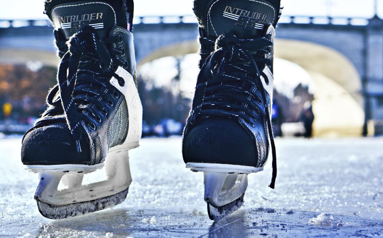
Get lost in the beauty of our star with Seán Doran‘s film “One Month of Sun”. Constructed from more than 78,000 NASA Solar Dynamics Observatory images, the video shows solar activity from August 2014, particularly the golden coronal loops that burst forth from the sun’s visible surface. These bursts of hot plasma follow the sun’s magnetic field lines, often emerging from sunspots. (Image and video credit: S. Doran, using NASA SDO data; via Colossal)
Droplets infused with particles — like coffee — can leave complex stains once they evaporate. Here researchers show the complex cracking pattern that develops as a droplet with nanoparticles evaporates. The central image in the poster actually shows the drop’s pattern changing in time. The initial drop is shown at 9 o’clock, and as you move clockwise around the drop, time passes and the crack structure becomes more complex. What a neat way to visualize the changes! (Image and research credit: P. Lilin and I. Bischofberger)
A thin fiber sitting atop a bubble can spontaneously coil around the bubble thanks to elastocapillarity. (This seemingly bizarre behavior is also why wet strands of hair clump together.) Here’s the situation: The dark circle you see is all bubble; only a portion of the bubble — known as a spherical cap — sticks above the surface of the liquid. When a fiber sits across the top of the bubble, two things can happen: 1) the fiber simply sits there until the bubble bursts, or 2) the fiber starts to bend and wind around the bubble’s cap.
Bending the fiber takes energy. In this case, that bending energy comes from the system as a whole reducing its free energy. The fiber actually sinks into the bubble film in what the researchers call a “bridged” configuration, where the fiber sits inside the liquid film while also touching the air inside and outside the bubble. In this position, the interfacial energy of the fiber-bubble system is lower, leaving enough excess energy savings for the fiber to coil. (Image and research credit: A. Fortais et al.)
I confess I’d never heard the term derecho before moving to Colorado, but I’ve experienced a few of these wind storms now. They’re intense! Last December’s derecho formed when a high-pressure system in the western United States met a strong low-pressure system over the northern plains. In fluids, flow moves preferentially from areas of high pressure to those with low pressure, and that’s no different when it comes to weather. The strong pressure gradient drove high winds from the Rocky Mountains to Minnesota. The animation above shows the strongest winds in in yellow-white but even the “weaker” pink areas saw winds comparable to a fast-moving car in speed. The visualization is constructed from data reported by ships, buoys, aircraft, satellites, and other sources, all processed through a NASA weather algorithm. (Image credit: J. Stevens/NASA; via NASA Earth Observatory)
Rocky islands make excellent atmospheric swirls, as seen here around Guadalupe Island. Winds blowing in from the ocean get forced up and around the island’s topography, resulting in vortices that shed alternately from either side of the island. The pattern they form is known as a von Karman vortex street and is easily seen in satellite imagery, thanks to the swirls that can persist for tens of kilometers downstream. Personally, I never get tired of this one! (Image credit: NASA/GSFC/JPL; video credit: NOAA/CIRA; via Dakota Smith; submitted by @SellaTheChemist)
A year ago I observed what a strange year 2020 had been, and in many ways, I could say the same of 2021. Before the pandemic, I spent quite a lot of time traveling. In 2021, the only nights I slept outside my own bed came on a long weekend up to the mountains with my family. But 2021 also saw a bit of a return to normalcy – I was giving keynote addresses and workshops again, albeit virtually. What will 2022 hold? Who knows?!
As per tradition, here are the top FYFD posts of 2021:
It’s an eclectic mix of topics this year: bizarre phenomena, stunning art, archaeological exploration, and a touch of biophysics!
If you enjoy FYFD, please remember that it’s primarily reader-supported. You can help support the site by becoming a patron, making a one-time donation, buying some merch, or simply by sharing on social media. And if you find yourself struggling to remember to check the website, remember you can get FYFD in your inbox every two weeks with our newsletter. Happy New Year!
Photographer Andrew McCarthy constructed this spectacular 300-megapixel image of our sun by compositing thousands of individual images. Sunspots, coronal mass ejections, and feathery convective swirls abound. Check out his site for prints of this and other celestial images! (Image credit: A. McCarthy; via Colossal)
That the wind causes ocean waves is obvious to anyone who has spent time near the water, but the details of that process remain fuzzy. Many of the explanations — like the Kelvin-Helmholtz instability — only explain part of the process, usually the beginning when the waves are very small. As the waves get larger, they affect the wind in turn, complicating matters.
As messy as the theory gets, our ability to measure the wind and water in situ is limited, too. Just look at this wild research platform oceanographers designed to study wind and waves. It’s part of a 355-ft vessel that’s towed out to sea horizontally and then flipped so that 300 feet of it remain underwater to stabilize the remainder for measurements. Even with equipment like this, measuring the turbulent air and water near the ocean-sky interface is incredibly difficult.
This review article gives a nice overview of different historical efforts to explain how wind makes waves and provides a snapshot of the latest research in the area. (Image credit: R. Bilcliff; see also N. Pizzo et al.)
To take these high-resolution images of individual snowflakes, Nathan Myhrvold and his collaborators built a special camera. Their apparatus keeps the snowflakes chilled despite the strong illumination cast on them. It uses a 500 microsecond shutter and focus-stacking to produce incredibly detailed portraits of these ephemeral subjects. Each snowflake’s shape is the result of the temperature and humidity that crystal experienced as it grew. Since these are natural snowflakes, no two are alike, but, with enough environmental control, it is possible to make twin snowflakes. (Image credit: N. Myhrvold; via Colossal)
As wearing face masks for long periods has become more typical, you may have wondered whether a soggy mask offers less protection. All masks — cloth, surgical, and N-95s — get moist from their wearer’s breath. A recent study indicates this isn’t a cause for alarm, though.
Researchers looked at how relatively high-speed droplets (like those from a cough or sneeze) impact dry and wet masks. These high-speed droplets can break into smaller droplets upon impact with a mask layer. The more layers a mask has, the fewer droplets make it through. But even for single-layer masks*, a moistened mask layer lets fewer droplets through. So you don’t have to worry if it’s a little humid in there. Your mask is still working! (Image credit: top – V. Davidova, other – S. Bagchi et al.; research credit: S. Bagchi et al.; via APS Physics)
* To be clear, you should be wearing masks that are more than a single layer thick. Personally, I’m still only going into indoor public spaces in an N-95 at this point.
Droplet penetration through a mask. Top row: dry, single layer mask. Middle row: wet, single layer mask. Bottom row: wet, triple layer mask. When wet, masks permit fewer droplets through.